

Behind the Book with Jane Powers
What do delicious drinks and vibrant designs have in common? They both have starring roles in Fruitful: A Book of Unabashedly Fruity Cocktails, by Jane Powers. We love everything about this recipe collection, from its bold typography and colorful illustrations down to the smallest details. So, grab a refreshing drink and follow along as we delve into the author’s bookmaking process and creative choices, cover to cover.
1. What inspired this book project?
I’ve been interested in mixology for a few years now, and I’m really drawn to cocktails aesthetically, so I felt I could make a cool book myself. I also own quite a few cookbooks now, and will only purchase well-designed ones. So I wanted to create a book that I would want to own. I also feel as though “fruity drinks” get kind of a bad rap, so I wanted my book to open that selection up to a wider audience. I think they’re delicious, and more people should have the opportunity to try them.
2. Tell us about your creative process for designing this book. How did you decide on the trim size, format and cover design?
I started by creating moodboards so I could have a focused direction. Then the internal design of the book started with me creating as many fun, rounded grids as I could. I digitally created as many of those as possible, and let the actual recipes dictate which ones worked. It was a lot of fun to just play around with colors, add my illustrations, and just be loose with my design.
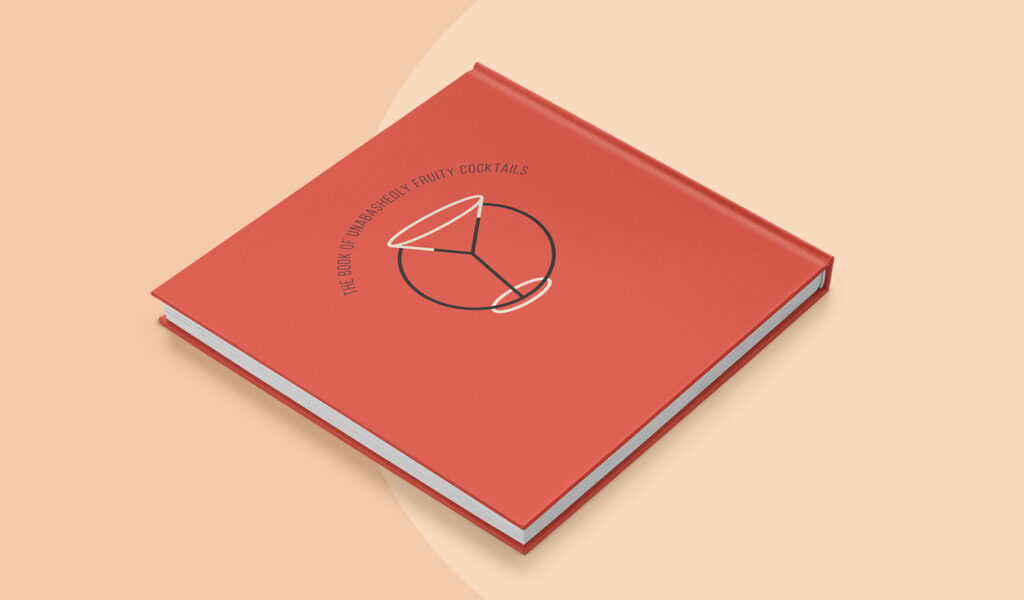
I really let the content inform my choices for the physical dimensions of the book. Cocktail recipes are short, and I knew I didn’t want to pack my book with multiple recipes per page. A 7×7-inch book gave the recipes room to breathe, and the hardcover gave it the professional quality I wanted.
The cover looks pretty much how I pictured it; in a way it was the first thing I designed. Once I had the title “Fruitful,” those huge letters just popped into my head fully formed. I played with some details to customize the type, but I knew from the start what I wanted the cover to be.
3. How did you achieve the typography treatment of the cocktail names?
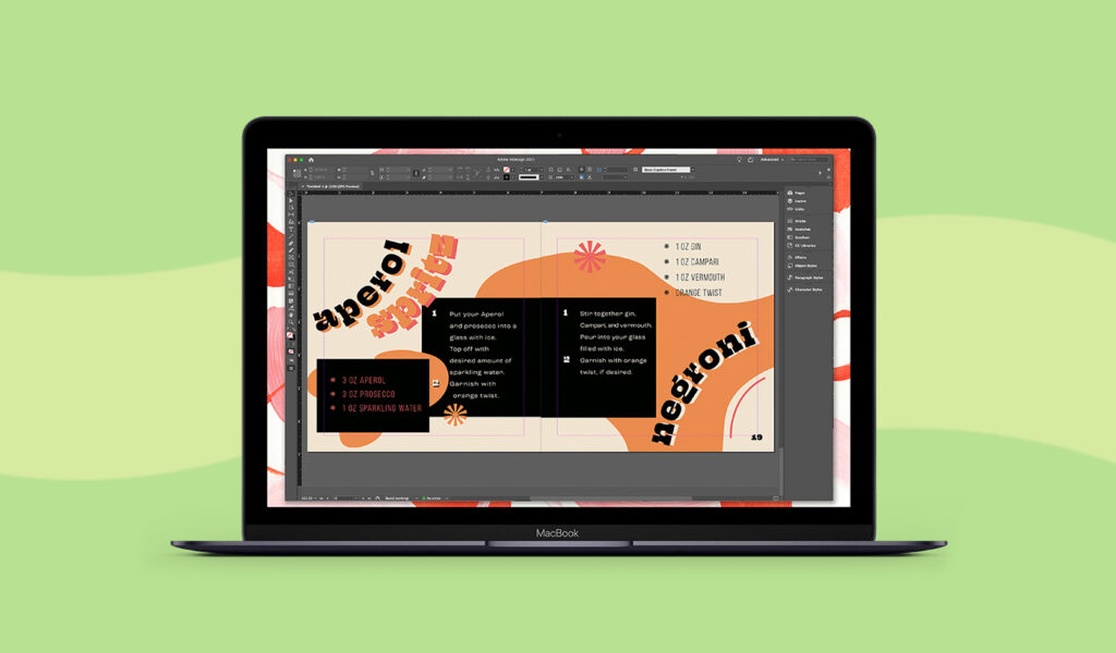
Probably my favorite choice of the whole book is the western typeface, because I think it comes out of left field but really works.The recipe titles were a result of probably hours of fine-tuning. They were always going to be mostly on rounded paths, because I thought they looked way more eye-catching, especially with such short recipes. Eventually, I doubled the titles, filled in some individual letters, and just moved around the kerning. My favorite detail I added was the two little seeds in the Watermelon Sugar title; that’s the sort of thing I wanted to put in so you could find new details each time you looked.
4. Is there a story behind your choice of colors for this project?
I just wanted my colors to look warm and summery, and evoke that fruity impression. I tried to pick a palette that would work for my full range of drinks.
5. Why did you choose to include illustrations instead of photographs?
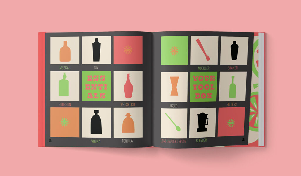
I felt illustrations were a much better use of my skill set. I had an original plan for what the illustrations would look like, and they completely evolved once I started playing with the patterns and layouts. It also made sense for my budget and the vibe I was going for.
6. Which tools or software did you use to create your PDF files and why?
I used Blurb’s Adobe InDesign plugin for the creation of the book and cover, and the illustrations were executed in Adobe Illustrator. InDesign has tons of grid, layout, and typography capabilities, so the book would come out clean, no matter how many organic elements I added. When it came to my illustrations, Illustrator was really the only program where I could adequately experiment with my pattern designs.
7. What are the most common mistakes people make in book design (cover, font, page layout, colors, etc.)?
This is actually my first book design, so I’m no authority, but I’m an advocate for accessibility in all areas of design. I’ve seen a lot of people struggle when copy isn’t legible or readable, so I think it’s important to pay attention to the scale and color of your typographic content. I believe a book should balance form with function. The cover is also one of the biggest factors in book design, and it’s so unique to books; sometimes the cover isn’t given enough attention, or there isn’t enough of a risk.
8. What advice would you give someone who wants to turn a collection of recipes into a cookbook?
The main thing to think of is your “gap in the market”, so to speak. In my initial stages of research I, of course, found tons of cocktail recipe books. However, there weren’t too many dedicated to “fruity drinks”, at least not any I would want to own. So I curated a list of some sophisticated takes on “fruity drinks”. It was important to me that a consumer looking at my table of contents would find a good mix of recipes, but a cohesive list. I think if you frame your content in a way that’s new and exciting, and then execute the design really well, you’ll have a great finished product.
9. Where do you look for creative inspiration?
I’m so thrilled to be living in the age of the Internet, because we have literally endless inspiration at our fingertips. I find the most online inspiration from Pinterest and Instagram, where I get to look at other artists. I also am always reading about typography and art, so books end up playing a huge role in my creative landscape. I’m also always taking pictures of things that interest me in my everyday life, or at least writing them down in my notes.
10. Any design projects you’re currently working on or excited about?
This summer I’m really going to be focusing on painting, and I’m freelancing for a few clients. In the fall, I’ll be headed to school to get my Master’s degree in Media & Information Design, so my thesis will be my next big project! I’m excited to see where all of that takes me.
11. How did the process of designing a book compare to your other creative work, such as your paintings and graphic design projects?
I’ve classically been a bit of a perfectionist, so this project provided me with the opportunity to play around a lot. I was designing with a consumer in mind, but it’s not imperative that anyone buy it, so I took that opportunity to do exactly what I wanted to do, which I believe paid off. There aren’t many times in design where you just get to have fun and make all the executive decisions, so I feel like I have a product that totally reflects my point of view. A book is also one of the most intensive projects I’ve ever done, so I definitely needed to stay on top of my follow-through, but it was really rewarding.
Blurb is a self-publishing company that can help you design and print your books on demand. Want to create a cookbook or photo book project of your own? Start designing your pages today.
This post doesn't have any comment. Be the first one!