

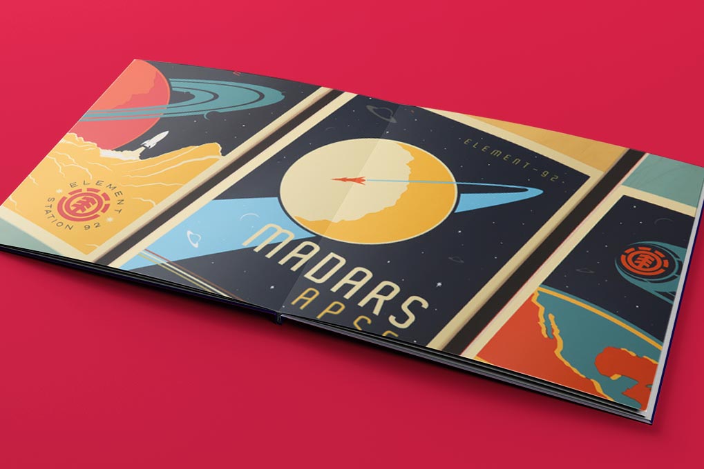
Layflat Visions from Graphic Designer Jarrod Bryan
For graphic designer Jarrod Bryan, the architecture of buildings is about much more than bricks and mortar. It demonstrates how the power of the creative process can bring one good idea to life, in stunning ways. His most recent project, Visions, celebrates this narrative, leveraging the seamless spreads of a Layflat Photo Book to showcase his skills as a professional designer with a story to tell.
1. Tell us about the concept for your Layflat photo book. How did you choose your images? How did you pair your spreads?
I wanted to create a book that showcased my range of skills and abilities as a creative person. I also wanted to create a book with work that I’m truly passionate about. Whether it be design or photography, I always focus on communicating a narrative. I feel like good design should tell a story. I pair my spreads by mood, color, tone, and narrative. Both images need to have aspects that connect and bind them.
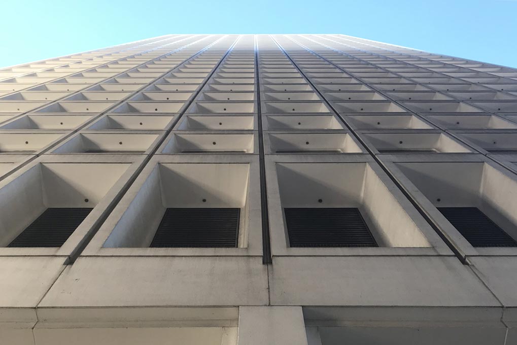
2. How does architecture catch your eye? What does it take? What do you usually notice?
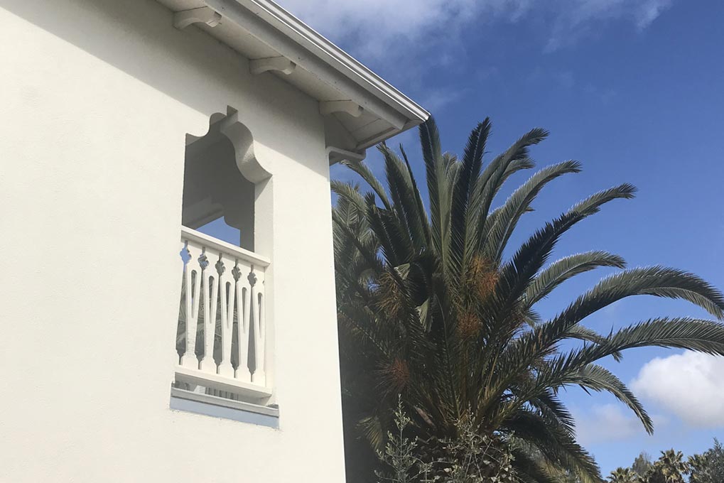
Patterns, scale, math, grids, light manipulation, and environment—all of these things attract my attention. Also, the sheer fact that every piece of architecture began from a single thought or idea that was then shared and collectively supported. Everything derives from creative thought. I’m blown away by what the mind can manifest into physical form. From skyscrapers to the ancient pyramids, all of these structures were a collective effort, stemming from one single creative thought. And it could have happened in the shower, or over a cup of coffee. It’s amazing—hence the title, Visions.
3. Why is Layflat a good choice for showcasing your work?
With so many intricacies in design and photography, especially architecture and landscape photos, it helps to have a seamless presentation for spreads. The gutter in a spread can be disruptive to the viewer’s experience. Layflat Photo Books create a consistent experience throughout and allow me to make a bigger impact. I also enjoy the paper quality. Having a heavier paper stock helps the images to lay flatter and have a higher quality texture and feel. It’s a great investment, especially when working with photography.
4. What tools did you use to design your book and why?
I use BookWright sometimes, mainly for quick Photo Book projects. Mostly I use Adobe InDesign and Blurb’s plug-in so I never have to leave my regular workflow. I work professionally as a designer so I prefer to use programs that enable me to take my book design as far as I want to go. InDesign gives me more options and flexibility when creating layouts and type treatments. The Blurb plug-in works great for project setup.
5. What do you use to take your photos? Why?
Just my iPhone. I don’t consider myself a “photographer” because I don’t invest in the actual craft of photography. I’ll capture visuals using my phone because I always have it on me and I can get hi-res images with that tool alone. I try not to use “filters” and just let the natural light do the work. I’m just a designer who likes to collect and use images taken with my phone.
6. What impact does paper choice have on your work?
I love using the Mohawk proPhoto Pearl Paper. The print has a metallic tint and sheen to it that brings out the lighter values in photos. It brought the images in the first iteration of Visions to life much more than I expected. It really elevates the presentation of the work. Seeing the printed book for the first time was like looking at someone else’s images.
7. What role does a print piece like this play in a designer’s portfolio?
Printed pieces are a powerful, tangible way to showcase your work. Everyone likes to “hold” printed examples of work and it serves as a great “leave-behind.” The purpose of this book is to showcase my range of skills and abilities and to promote myself as a multi-disciplinary creative. Although most portfolios are viewed online, it’s always nice to have physical examples in meetings with friends, clients, and potential employers. Having a book, as well as an online portfolio, shows how dedicated you are to your craft and how much you consider your presentations.
8. What’s your favorite style of architecture and why?
I know it sounds cliché, but mid-century modern. It has such a specific style that is heavily considered. It also has a timeless quality to it. No matter how much time has passed, the sophistication in the designs stands strong. I first started to notice and appreciate this style of architecture when I moved to Los Angeles some years ago.
9. What’s one print project you’d love to do one day?
Branding an airline would be a great accomplishment, as corny as it sounds. Imagine being a key contributor to the American Airlines logo for example…that would be a serious hammer to carry around in your portfolio. I would also like to design a vinyl album cover for one of my favorite bands one day. That would be a great personal accomplishment and one for the records (no pun intended!). Having the opportunity to contribute my design abilities to help promote and raise support for causes like health care, education, housing, and general wellbeing, in the U.S and abroad, would be very purposeful and fulfilling.
We’re inspired by Jarrod’s process and we’re so glad he took the time to talk with us! Get a peek at Visions in the Blurb Bookstore.
This post doesn't have any comment. Be the first one!