

Quick Typography Tips for Non-Designers
Consciously or unconsciously, typography communicates to us every day. The visual appearance of your words is crucial to the communication of information and ideas; the arrangement of letters on a page enables learning and conveys meaning in an important way. As a book creator, you can harness the power of typography to give your work more impact.
Typography refers to the style, arrangement, and appearance of letters, numbers, symbols, words, and lines. It’s the art and technique of arranging words and letters to make your text visually meaningful, legible, and appealing. Follow these typography tips to ensure your project has that pro look.
ty·pog·ra·phy
tīˈpäɡrəfē/
noun
Tip 01
Stick to a small, complementary font palette
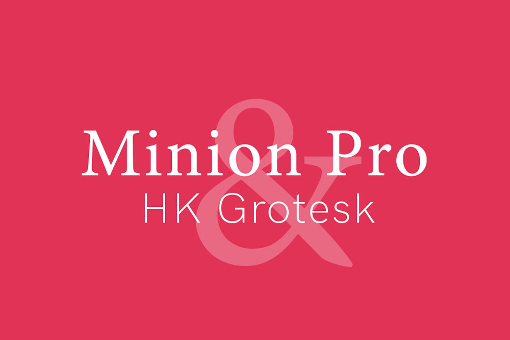
With so many cool and interesting fonts available, it can be tempting to get a bit too creative in our choices. Restrain your creativity in favor of consistency and readability—2-3 fonts for the whole project. Choose one font for display—headlines, large copy, logos, and labels. Choose a readable, basic font for block text and body copy—serif fonts in long text guide the eye. You can choose a third font for additional headings and labels, but often, these are just done in a larger version of your body copy font. Pair a sans-serif font with a serif font, a script font with a more rigid, classic font. That typography contrast is interesting and helps with readability.
Tip 02
Create a purposeful hierarchy
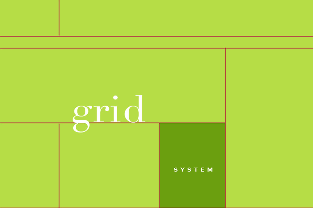
Create a pattern of headings, subheadings, labels, captions, and body copy, then break your text into these categories. Be consistent with the formatting for each of these types of text—always use the same font, weight, size, etc. The most important information gets the biggest, boldest treatment in your layout. The goal is to create text that is easy to scan and navigate.
Tip 03
Prioritize readability
Three things make your project clear and readable: lots of white space, font choice, and color. Make sure your letters have plenty of space between them, leave enough space between lines, between heading, and text boxes. Leave large margins, opting for more pages over less white space. Choose high contrast (black on white, black on pale green, etc) in complementary colors. Too much color activity is hard to read, so use harmonious colors that work together.

Tip 04
Align and shape your text blocks
When in doubt, justify to the left. Right justification is for small blocks of text and style contrast. Center justification is mostly used for headlines and light copy that’s 3 lines or fewer unless it’s a poem. When you justify to one side, you’ll see one side is ragged. After the copy is placed, go back through and create your own line breaks to make that ragged edge as even as possible. Also, check to make sure there are no “widows and orphans”—lines that land on the next page or single words at the end of text blocks.
Tip 05
Design for the shape of the book
Mind the gutter! You never want any part of a word to be lost in the center crease of the book. You also want your typography and text blog styling to reflect the shape of the page where it’ll be. Text blocks should follow the portrait and landscape shape—either tall, narrow blocks or wide blocks, or multi-column layouts. The most readable lines have only 30-40 characters including spaces unless you’re working with text-only full-page layouts, which are around 100 characters.
You can get ideas and tips for your own typography by looking around you—pay attention to the different arrangements of words, and notice how they work, what they make you feel, and what associations they bring to mind. As you’re laying out your text on your own book pages, ask yourself: Is this text working as hard as it could? Could I say more if I formatted it differently? Is it as clear and distraction-free as I could make it? The more attention you pay to the arrangement and appearance of your characters, the clearer and louder your message becomes.
This post doesn't have any comment. Be the first one!