
What Makes a Great Layout? Design Pros Weigh In
Ok. You have all your photographs; you’ve even written some text to go with them. But how do you place it on the page? How do you get that clear, cohesive, and contemporary look that’ll complement your content? Your layout will tie together your photo and text elements to draw in your reader and lead their eyes across the page. It isn’t about just what looks good. The key is to make the reader look at the right elements in the right order so that they understand the ideas you’re trying to communicate.
We asked 5 designers, who have worked in both print and digital, to talk about their design framework.
DESIGNERS & EXPERTISE
Debsue, UX Design
Jarrod, Graphic Design and branding
Alex, Design, Branding, and Advertising
Sylvie, Graphic Design, Watercolor, and Stationery
Stacey, Graphic Design, Design Theory, and Drawing
1. What are some design principles that you live by?
Debsue:
– One idea per page
– Establish a hierarchy—What’s most important and how do you show that.
– A little color goes a long way
“When I first start a project, I usually have more than I need cluttering up my book. I spend about 20% of my time, simplifying layouts, culling pages and working on the flow of the book after I think it’s complete.”
Alex & Sylvie: Live and die by The Grid.
Sylvie: The way I think about this is to imagine the page divided into evenly sized boxes and then I try to make sure that all the photos and text boxes align with these imaginary boxes. The brain appreciates straight lines, symmetry and a sense of order and using a grid definitely helps with all those things.
2. What do you look for when you’re deciding what content goes on a page? How do you connect images, what makes them go together, etc?
Debsue: I need to see all the photos that go together at once, so that I can figure out what works together and what does not. I look at the shapes, colors and textures at once to see if they will look good in a spread. Sometimes my favorite images don’t look good when seen next to something else, so I must move the page to the right place based on my own aesthetic. Sometimes that means the photo will get a two-page spread, sometimes that means the photo needs to start or end the series—so it can be on its own—and sometimes that means it gets cut. It’s like spreading out all the puzzle pieces on the table before starting to put it back together.
Jarrod: I choose images that connect to one another to tell a cohesive, visual story. Tones, color, and subject matter should all relate.
Sylvie: Contrast is also something I always think about. Are all the photos in the spread the same color value—all dark or all light? Do you have a good mix of textures on one page? Ex: If one photo is very complex and dense, try to pair it with something that feels more simple and clean. This will help the page from seeming overly busy.
3. What guidelines do you use to balance images and text? How do you get pictures and text to work together? Are there placement guidelines? Sizing? Proportions?
Debsue: In part, the size of the book can dictate the size of items within it. If you decide you want 80 pt. text on a small book, it can look sophomoric but that size would look great in a 12×12-inch book. And 80 pt. text can look great in a small book, it depends on the words and the items around it.
Sylvie: Another trick you can try when things feel a little ‘off’ and you can’t quite figure out why: zoom out so you can see the whole spread on one page, squint your eyes and literally back away from your computer screen. This will help you look at the text and photo elements on the page as abstract shapes, which can help you figure out if there is an imbalance in the overall layout instead of focusing on specific details.
Stacey: I get the pictures and text to work together by having a clear understanding the hierarchy and the grid. It is important to make sure that the images and content align with the grid and that there is rhythm, symmetry, and repetition to the layout. There are grid systems that you can download. I tend to repurpose some of the grids I have created and then find out where the golden ratio is in relation to design comp.
Alex: My three favorite grids: the fibonacci grid, the vertical rhythm grid, and the multi-column grid.
4. How many images go on a page? How do you know?
Debsue: I stick to ‘one idea per page’, but that can mean using 5 or more images when I am showing a process or when I can’t decide which images are the best.
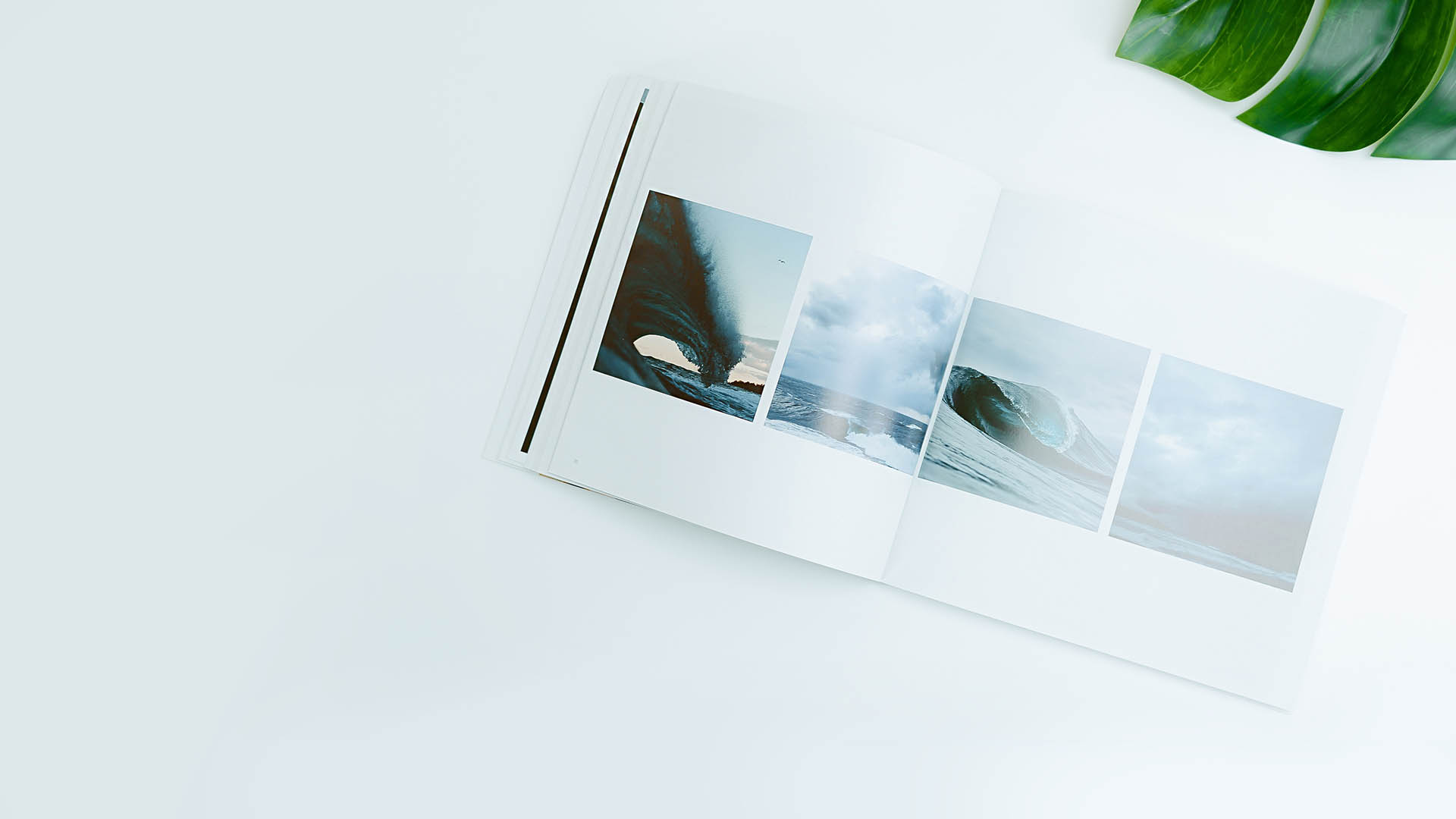
Sylvie: Using just one image on a page can be a powerful statement. Using two, three, or four images per page is also great because they will usually fit nicely into your grid. Keep things simple.
Jarrod: It’s all about balance—using positive and negative space in a way that allows multiple images to live together without feeling crowded.
5. What would you say to people new to layouts and design to steer clear of that rough, “amateur” look?
Alex: Overdoing it is the most common mistake. Adding extra motifs, extra colors, extra shapes, too many photos, too many font sizes. Sticking to two fonts, at two sizes, and two photos per spread (at least as you design your first book) is a great way to ensure your book will look nothing less than elegant and spectacular.
Debsue: Make a simple color palette before you start your book. Choose one main color and one or two accent colors that you use sparingly or not at all.
Jarrod: If you’re not a designer, you can still have good layouts from a template. Blurb’s templates are customizable and there are some really great ones out there that can help you achieve the look you want.
Sylvie: Make sure you’re giving each spread some room to breathe. Some people try to cram so much content onto each page and end up with pages that feel cluttered and overwhelming, making it hard to appreciate the beautiful images within. When mixing images and text, make sure there is ample spacing between each element. It’s also very helpful to consolidate your fonts. Try to pick just one font for your entire book and keep the text the same size throughout. If you are feeling adventurous, pick one font for headlines and another for longer form copy. There is rarely a case for using more.
Stacey: I love the amateur look. I find it refreshing, especially when it is genuine. I don’t want it to change, if anything I want to see more ‘amateur’ whatever that means anyway.
Thanks to our designers for sharing their expertise with us. Now it’s your turn! Get started on your project with one of our free professionally-designed templates.
This post doesn't have any comment. Be the first one!