

Dos and Don’ts of Halloween Fonts
Decorative fonts are often used during different holiday seasons, but not always successfully. Here are a few dos and don’ts to stick to when working with decorative Halloween fonts.
Do choose a font that enhances your message
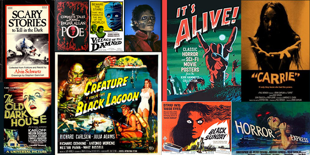
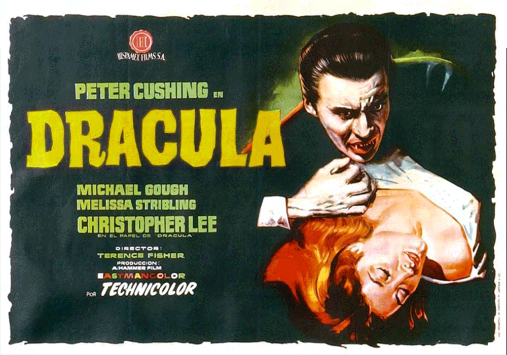
Choosing a font can be a daunting task because the options are endless. It’s important to trust your intuition and know what mood you are trying to project. Instead of spending hours looking for the “perfect” font, try to narrow your options by creating a mood board of inspiration containing film posters, book covers, or album art that influences you.
Do choose a bold font for a dark background
Choosing a font that compliments the mood of your design won’t be effective if the viewer can’t read your content. If you’re working on a dark background, choose a font with a heavier weight for maximum contrast and readability.

Do experiment with color
Introducing color to your text can add hierarchy and tone to your design. When considering color, remember that less is more and that the most obvious color choice isn’t always the best one. For example, black and red can be a subtle but spooky take on Halloween, and blue and silver effectively hint at luxury and non-denominational celebrations in December.
Do adjust the leading and kerning of your font
Check the spacing between characters (kerning) and the spacing between lines (leading) to ensure your design is even and readable. While letter spacing may seem like a small detail, it can make or break the subconscious visual impact of your font choice for your viewer. Spatially, your design should flow in a natural and organic rhythm. If the viewer doesn’t notice the leading and kerning of your design, you’re doing something right.
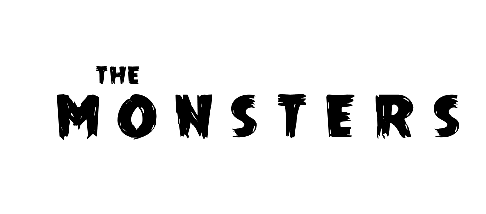
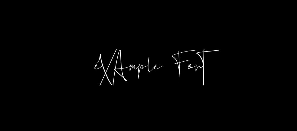
Don’t choose a font that is so stylized it is unreadable
Legibility is the most important factor to consider when choosing a font. Regardless of how interesting the font is, if your “C” looks like an “O” your design, is flawed. Scan your font characters to ensure they all look unique. If you absolutely love a font, but one letter does resemble another, you can always use a program like Illustrator to adjust the characters slightly.
Don’t pair two overly stylized fonts together
Too many fonts, like too many colors, can make for chaotic design. One decorative font within a design is typically enough. If you add another decorative font, make sure to use a variety of font weights and sizes to create hierarchy, and keep your color palette monochromatic to create cohesiveness.
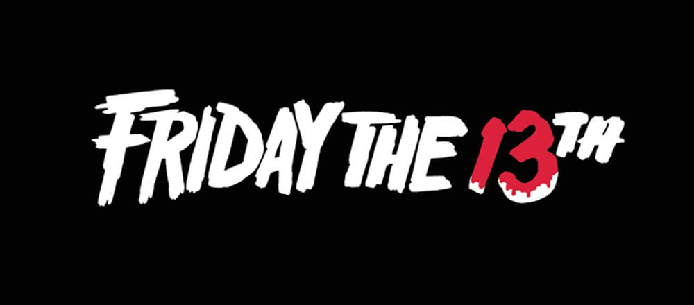
Don’t choose a font that is overly recognizable
The point of choosing a seasonal font is to immediately evoke a specific feeling or reference a recognizable experience before the viewer has a chance to read your content. You’re speaking to their subconscious a little bit. But if you choose a font that is too strongly associated with a specific brand or product (the fonts for the films The Nightmare Before Christmas or Friday the 13th come to mind), your design may read as unoriginal or cheap.
Don’t take too many risks with your layout
Just as with color and font, a little experimentation with non-traditional alignment goes a long way. If you’re using a seasonal font, keep your grid simple. Good design should always come first.
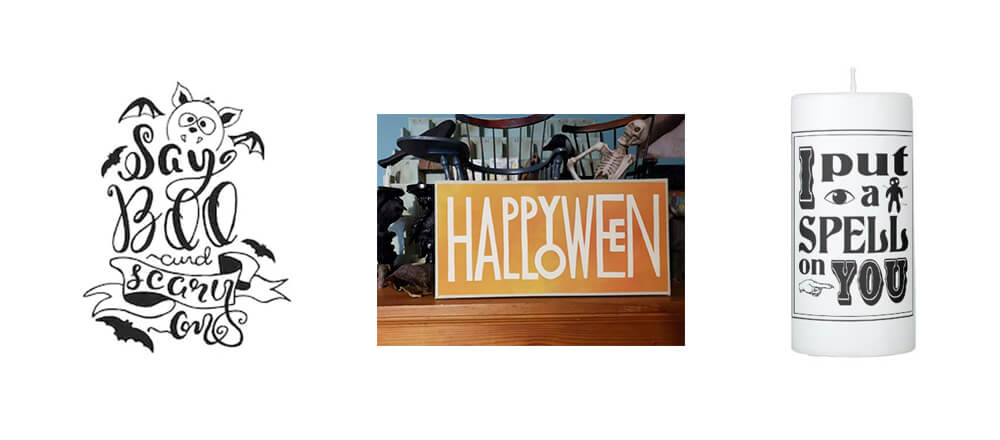
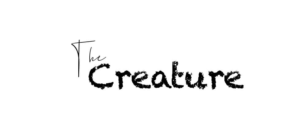
Here are a few decorative fonts I plan on using this Halloween season:
Do you have a favorite spooky Halloween font? Let us know in the comments below!
This post doesn't have any comment. Be the first one!