

Hit the Books with Dan Milnor: Photo Editing in Adobe Lightroom
I imagine that those of you who spend your lives with a camera in hand won’t need an introduction to Adobe Lightroom, but for those new to editing photographs, let me explain. Adobe Lightroom is an image organization and manipulation software that’s part of the Creative Cloud subscription family.
What is Adobe Lightroom?
Lightroom is best at importing, saving, viewing, organizing, tagging, editing, and sharing digital images. The editing functions are extensive and include white balance, tone curve, lens correction, spot removal, and many other image manipulation options. Based on my informal surveys of Blurb audiences worldwide, Adobe Lightroom is the most popular organization and manipulation software available today. And for those with inquiring minds, the name Lightroom is in reference to darkroom, synonymous with the rooms used for processing light-sensitive materials during the analog era.
Why editing your images is subjective
Before we head further into Lightroom’s functionality, let me say that image manipulation is incredibly subjective. Modern software offers endless options for tweaking image files. But just because these options exist doesn’t mean you should utilize all of them. In my opinion, when it comes to editing and manipulating files, less is truly more. Intelligent software and intelligent editing are about one thing: efficiency. Being efficient in post-processing means spending less time on screen and more time in the field making new images. The primary goal of this article is simply to present a small set of manipulations that will clean up your digital files.
Preparing images to use in a book
Since this is Blurb, we must talk about books. Preparing images is fun. Preparing images to use in a book is even more fun, and that’s why we’re here. Does the book add anything special to the image prep process? Does the paper type or paper thickness add to the complexity? Short answer: yes. But let me revisit the comment I made about subjectivity. When it comes to image preparation, there are certain things to keep in mind, but ultimately your vision is what counts. So, understanding the basics of image prep can help you realize this vision in a fun and efficient manner while increasing your chances of producing your perfect book.
Calibrate your monitor
Before diving into Lightroom, there is one thing you must do before anything else: Calibrate your monitor. There are many excuses for avoiding the color management and calibration process, but none are valid. Calibrating your monitor is a simple yet critical part of the photo editing process. Otherwise, you won’t have an accurate assessment of what you’re seeing on your monitor. What you think is blue or green or red may or may not be.
Lightroom basics
Lightroom consists of several modules including Library, Map, Book, Slideshow, Print, Web, and Develop. The Develop module is where the bulk of your image preparation will take place. It supports non-destructive batch editing of images and offers enhancing options like white balance, tone, sharpening, noise reduction, cropping, and image conversions. It also provides presets, prearranged sets of image profiles you can apply to your photographs.
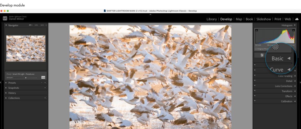
Basic menu
Once inside the Develop module, you will see a list of options on the right-hand side. Basic, Tone Curve, HSL, Color Grading, Detail, and more. Let’s start with Basic. As I mentioned before, the photo editing options, even within a single menu like Basic, are nearly limitless, but also remember my suggestion that less really is more. With this in mind, I will only focus on a few of the available options within Basic, beginning with white balance.
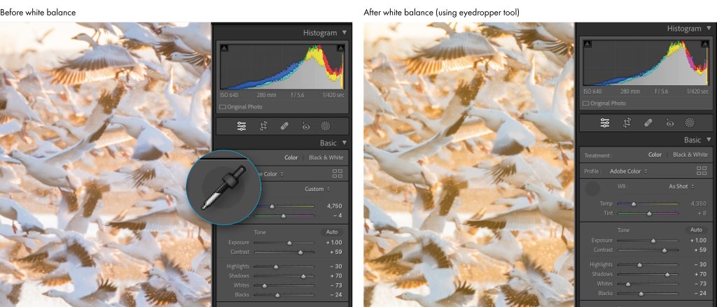
Many of us use the Auto White Balance setting while making our images. Although modern cameras are good, they aren’t always perfect, and one of the easiest and most important image enhancements is to correct our white balance to match what we see in the field. One way of correcting white balance is with the eyedropper tool. Once you click on the tool, you can move your cursor over the image until you find a neutral target. In this case, the white of the bird’s wing. The before image shows the white balance as slightly cold and blue and not accurate to what I witnessed in the field. The after image shows the warm glow and neutral white that reflects the beautiful morning light.
Tone and Presence menus
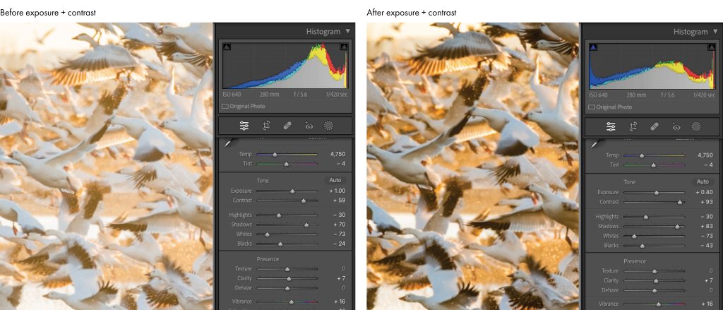
Next, let’s talk about the Tone and Presence editing options. The Tone menu allows for adjustments to exposure, contrast, highlights, shadows, whites, and blacks. Each photo will require specific ingredients, but this menu offers overall image control. Again, tread lightly and avoid making massive moves on the adjustment sliders.
The Presence menu offers photo editing options to control texture and clarity as well as dehaze an image. Presence also controls both vibrance and saturation. One of the most common mistakes I see when preparing images for books is to overdo the saturation settings. An overly saturated image, enhanced beyond what paper can display, will simply not print the way you see it on the monitor. The color will clip and the image will appear muddy and dull. Most modern, digital cameras create files that are near perfect right out of the box, so again, slight tweaks to vibrance and saturation can be fine.
Tone Curve menu
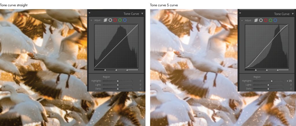
Next up, is the Tone Curve menu. The Tone Curve is a complex photo editing topic, but it is important to understand how it works. The Tone Curve is a visual representation of all the tones in your photograph, and it is represented by a diagonal line inside of a box. By dragging specific segments of the line, you can control the shadows, mid-tones, and highlights in your photo. Be gentle. The goal of the Tone Curve is to make your image pop. The most used technique is to create an S curve by dragging the lower third down and the upper third up. Doing so will often make your image pop by increasing contrast and saturation. If for any reason you wish to flatten an image or reduce the contrast and saturation, just create a reverse S curve.
Detail menu
The next photo editing option I want to discuss is the Detail menu, which controls the sharpening of your images. Most modern cameras require very little extra sharpening. In short, over-sharpening will ruin your images, so be very careful when applying this feature.
There are four different sliders in this one menu.
- Amount allows you to manually set the amount of sharpening you desire.
- Radius controls the sharpening of edges within the image. The default setting for Radius is 1.0, meaning Lightroom will apply sharpening to one pixel around the edge of an object. I rarely if ever move beyond the default setting.
- Detail slider tells the software which edges to sharpen, from smaller edges to larger edges. This slider should be kept under 50.
- And finally, the masking slider masks out the areas that should not be sharpened. This feature works best with simple images with one primary area of focus rather than visually complex images like the geese photograph you see here.
Additional Lightroom menus
The HSL and Color Grading menus are important but also complex and require a fair amount of practice and experimentation. Lens Correction, Transform, Effects, and Calibration are other menu options that can be important. These menus offer things like removing chromatic aberration, adding vignettes, and adding grain, but if you are new to prepping images for print, leave these menu options for a later date.

Image presets
There is one more option worthy of discussion: image presets. On the left side of the Develop module, right under the Navigator tab, you will see the Preset tab. Your presets will vary depending on your version of Lightroom. A preset is a predetermined set of ingredients that will be applied to your image with just one click. These ingredients could include color, curve, grain, sharpening, contrast, and more. You simply select an image then hover your cursor over each preset option, and the resulting effect will be visible in both the small navigator window and in your primary image.
Lightroom also allows for creating your own custom presets or importing presets created by other photographers. To create your own custom preset, make changes to an existing photograph. Once finished, click the + symbol in the header of the Preset panel and choose Create Preset. In the resulting pop-up window, you name the preset then check the boxes that reflect which settings you want to preserve. Then click Create.
***
Adobe Lightroom is arguably the most robust photo editing and organization software ever created. With this incredible piece of engineering comes a learning curve. Like all other software, Lightroom requires a test drive or two. If you are new to using this platform, just relax and know that you have endless opportunities at your fingertips. Be patient, start slow, and practice. Making these basic adjustments will make your photo book look that much better and make you feel more in control of your photography workflow.
Check out our blog post for tips on how to improve your images in Adobe Lightroom. Ready to try your hand at Adobe Lightroom? Let’s get started with Adobe Lightroom!