

Prolific over Perfect: Spotlight on Chloe Ferres
Chloe Ferres is an Australian creative based in Sydney, who’s prolific in photography, design, and teaching! She’s made project after project with Blurb, each one unique. Her experimental style and passion for photographic exploration are infectious and inspiring. We caught up with Chloe for a look behind her books and photography for some insight into what keeps her producing such interesting work.
Tell us about your books. What motivated you to make them?
My motivation to make books definitely comes from my parents; my mother is a librarian and my father has always faithfully documented life, creating family photo albums by hand, cropping the old fashioned way with a ruler and blade.
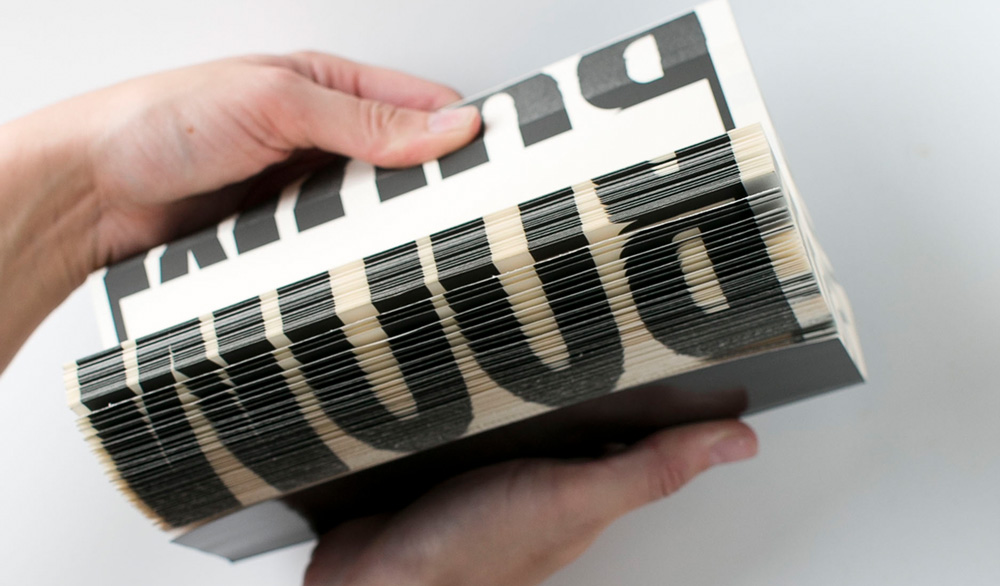
Fellow book-makers are a constant source of encouragement, and occasionally I get a small group of photographers together for a Photobook Club. I’m thankful that Ursula Hechenberger-Schwärzler first introduced me to Blurb, and I’ve been known to compete with Sarah Abad and Debbie Gallulo to see who can make the most books before a particular Blurb discount code expires! A talk by Daniel Milnor initially sparked my experimentation resulting in 3X300, a comment from Kent Hall inspired The David Hockney of Books, and Garry Trinh encouraged me to make a flip book, which became Bicubic.
Books on my shelves give me something to aspire to, my favorites include Paul Graham’s Films, Jungjin Lee’s Unnamed Road, and anything Irma Boom designs.
How do you connect your books to your audience?
First of all, I create books for an audience of one—me. Once I have a book on my shelf, I am satisfied. Sharing my books with others is just a bonus.
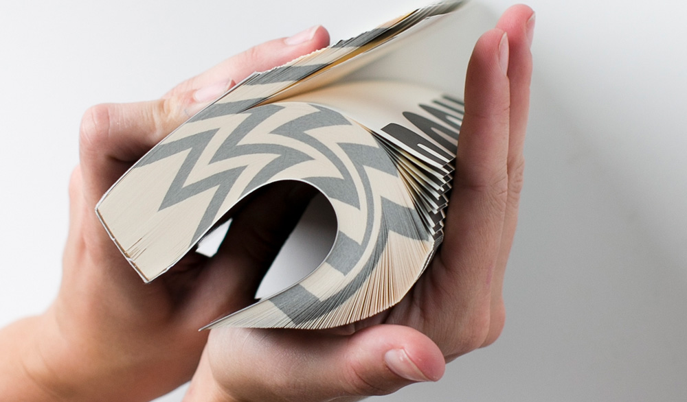
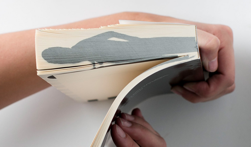
My work often exploits the tactile nature of books, therefore most of my designs need to be held to be truly appreciated. I’ve shown my work at Melbourne Art Book Fair and Volume Art Book Fair in Sydney, Australia. In the future, I would love to travel to art book fairs around the globe.
What factors go into your design and format decisions for your books?
Price is a huge factor when designing experimental books because I’m not always sure how things will turn out. Until I’m holding the finished product, my books are just theoretical, intangible bits and bytes.
I’ve found the affordability of Blurb’s trade formats to be liberating. I’m especially fond of the economy black and white printing which has a low-fi look, and I don’t have worry about conserving my page count.
What’s the thinking behind your designs? How do you know what to put where?
I work very instinctively, often resolving concepts in my mind before I sit down to design. French writer Antoine de Saint-Exupéry’s words usually come to mind when I’m finalizing a work, “perfection is attained, not when there is nothing more to add, but when there is nothing left to take away.” However, I don’t actually strive for perfection, instead, I embrace the Japanese concept of wabi-sabi, referring to things imperfect, impermanent, and incomplete. My work often highlights things which I consider to hold wabi-sabi, like traces of light and shadow, as well as digital artifacts like pixels and code. I’m also of the belief that done is better than perfect, I’d rather press print today, than never get around to finishing something!
How long have you been taking photos? When did you first pick up a camera and why?
My first memory of consciously composing photographs was at age nine in Paris, with the Eiffel Tower as my muse. I had a disposable camera, with three aspect ratios; standard, wide & panorama. Susan Sontag wrote, “to collect photographs is to collect the world.” Two decades on, my compulsion to collect still drives my passion for photography, travel, and book-making.
Your style for your books has evolved to become less and less figurative—more patterns, light, abstract renderings. How did you get here? What thoughts and ideas are guiding you to create in this unique way?
I’ve long sought to simplify the world through my viewfinder, seeking beauty, removing distractions. I think abstraction is the ultimate manifestation of this. As I have become more confident in my practice, my work has evolved to become more “me”. I concern myself less with others what others are doing, have done, or will think.
Why black and white?
Some might consider it an addiction; it’s not just my books that are black and white. I think a monochromatic color scheme is timeless and provides a nice contrast to our technicolor world. That said, I love bold color too— my home is predominantly black and white, which serves as a great backdrop for all the colorful books and travel mementoes I adorn it with.
Has there been a book you’ve made that’s your favorite? Which one (or not) and why?
Whichever book I’ve designed most recently is usually my favorite, that said 3X300 will always be special, as it signaled a turning point in my thinking about what a book could be.
Is there a project you dream of making and haven’t made yet?
I dream of designing a limited edition run of deluxe photobooks, with stitched spines, custom headbands, printed end sheets, and foil stamping.
Any advice you’d give to a new photographer? Or to someone who wants to take a hobby to the next level?
Practice your practice relentlessly, and don’t forget to love what you do.
We’re so thankful Chloe took the time to chat with us, and we’re taking her advice on going with prolific over perfect. Have any tips for dodging the perfectionism and getting to work? Share them in the comments below!
This post doesn't have any comment. Be the first one!