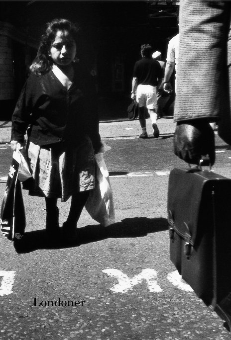
About the Book
Editing my work for the new website reminded me of the excitement of finding something new in pictures that I'd thought had nothing more to offer. It got me thinking of taking that process up again in book form which, as after publishing Ambiguous, I'd been taking a break from. Indeed, as well as selecting images, the process of sequencing, of shuffling, pairing and juxtaposing, was one I've really enjoyed and found to be another rewarding way of looking at my photographs.
My initial idea is to develop the Londoners theme. Seems obvious in retrospect but I suppose I've always considered the character of the city itself as significant an element in my images as the people themselves. Focusing, literally, onto individuals is a challenge to me. It's not "my style". However for me making books has become an opportunity to question just that. I love the constraint of working to a particular format, to a particular image size and shape. I'm attracted to print on demand services as I can experiment with these ideas at low cost. Consequently I choose another economy style, a little bigger than The Distance Between Us. As with that book it makes me think hard about one of my absolute articles of faith FULL FRAME, NO CROPPING. However whether by accident or by design - hey, another one of my catchphrases - this decision becomes a lot easier as the narrow, portrait format lends itself very well to the Londoners idea. The consequent crop gives the figures centre stage. Significantly some of the minor players, those with bit parts in the original, now come to the fore thanks to the scythe of the indiscriminate crop tool.
Initially the book takes on a claustrophobic mood. Images full bleed over the edge of the page, facing each other on left and right pages. I cannot seem to avoid the influence - although I'm certainly not in the company - of two of my favourite books, Invisible City by Ken Schles and Michael Ackerman's Fiction.
However I realise that the subject of the book is now the city itself, not the individuals as I'd proposed. As a statement of intent I re-name the book Londoner. I step the images away from the page edge. I give them each their own page of white space opposite. Two simple acts but transformative. The pace of the book slows. The energy of the images is not diluted but accentuated. The individual figures become just that, no longer competitors in an Olympian 100 metre dash, but characters in a marathon performance of Shakespearian comedies and tragedies.
http://seanmcdonnell.blogspot.co.uk/2012/12/were-all-londoners-now.html
sean@waysofwalking.net
Features & Details
- Primary Category: Fine Art Photography
-
Project Option: 6×9 in, 15×23 cm
# of Pages: 76 - Publish Date: Dec 29, 2012
- Keywords street photography, architecture, reportage, portraits, london, B&W, city, street
See More
About the Creator
Sean McDonnell
London
I've practised street photography in London and, occasionally, Paris, Tokyo & New York since the 80s. I enjoy discussing, showing and writing about my work. My photographs are in the collections of the Royal Photographic Society and the Bibliothèque Nationale and my work has been selected for the Museum of London's survey of London street photography. My latest work is the Ambiguous Book Project, a collaboration between photographers from around the world, now published on Blurb! Contact me at smcd22@gmail.com


